前言
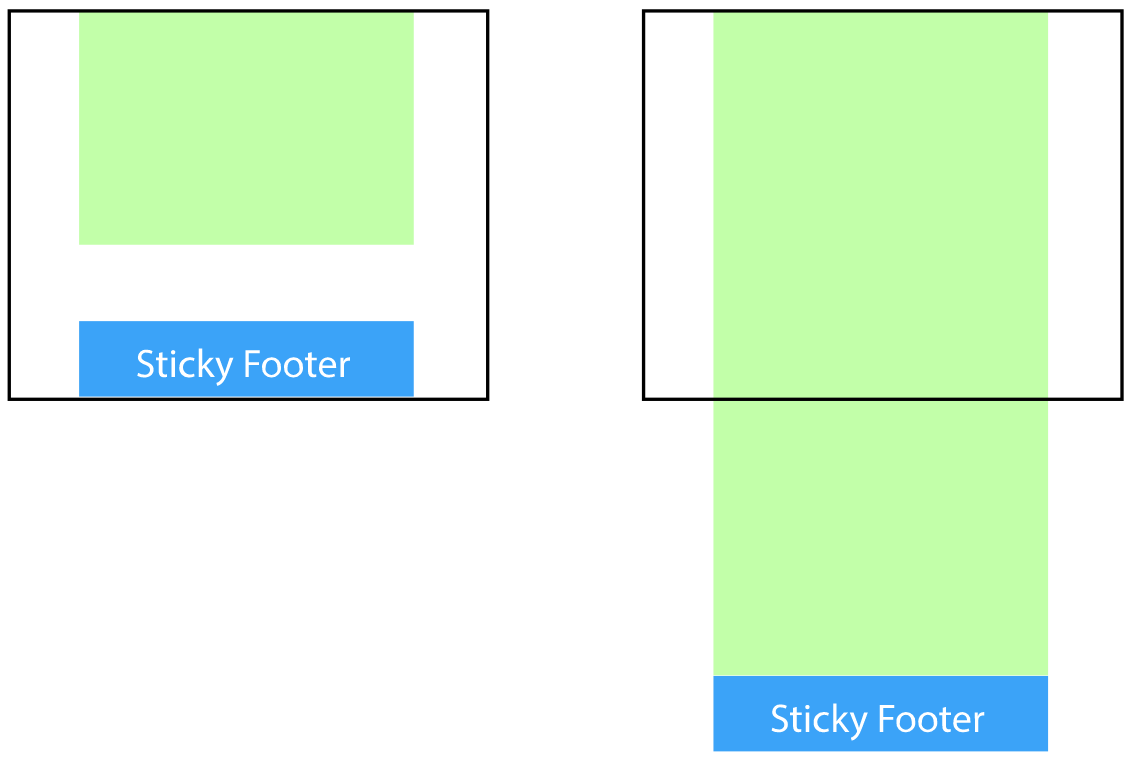
本文主要介绍使用css使元素粘住浏览器底部,无论内容区域多或者少,footer元素始终停靠在浏览器底部。盗图一张,嘻嘻
一、全局容器增加一个等于底部高度的负值下边距
建一个全局容器包含除了底部之外的所有内容,设置它的下边距 = - 底部高度
HTML代码:
<body>
  <div class="wrapper">
      content
    <div class="push"></div>
  </div>
  <footer class="footer">footer</footer>
</body>
CSS代码:
html, body {
  height: 100%;
  margin: 0;
}
.wrapper {
  min-height: 100%;

  /* Equal to height of footer */
  /* But also accounting for potential margin-bottom of last child */
  margin-bottom: -50px;
}
.footer,
.push {
  height: 50px;
}
这个代码需要一个额外的元素.push等于底部的高度,来防止内容覆盖到底部的元素。这个push元素是智能的,它并没有占用到底部的区域,而是通过全局加了一个负边距来填充。
二、全局容器底部元素增加负值上边距
虽然这个代码减少了一个.push的元素,但还是需要增加多一层的元素包裹内容,并给他一个内边距使其等于底部的高度,防止内容覆盖到底部的内容。
HTML代码:
<body>
  <div class="content">
    <div class="content-inside">
      content
    </div>
  </div>
  <footer class="footer">footer</footer>
</body>
CSS代码:
html, body {
  height: 100%;
  margin: 0;
}
.content {
  min-height: 100%;
}
.content-inside {
  padding: 20px;
  padding-bottom: 50px;
}
.footer {
  height: 50px;
  margin-top: -50px;
}
三、使用calc()计算内容的高度
- calc(): 函数用于动态计算长度值。
- vh: 相对于视口的高度,视口被均分为100单位的vh
HTML代码:
<body>
  <div class="content">
    content
  </div>
  <footer class="footer">footer</footer>
</body>
CSS:代码:
.content {
  min-height: calc(100vh - 70px);
  //给70px而不是50px是为了为了跟底部隔开20px,防止紧靠在一起。
}
.footer {
  height: 50px;
}
四.使用flex布局
关于flex布局可参考这里
HTML代码:
<body>
  <div class="content">
    content
  </div>
  <footer class="footer">footer</footer>
</body>
CSS代码:
html {
  height: 100%;
}
body {
  min-height: 100%;
  display: flex;
  flex-direction: column;
}
.content {
  flex: 1;
}
五.使用grid布局
关于grid布局可参考这里
HTML代码:
<body>
  <div class="content">
    content
  </div>
  <footer class="footer"></footer>
</body>
CSS代码:
html {
  height: 100%;
}
body {
  min-height: 100%;
  display: grid;
  grid-template-rows: 1fr auto;
}
.footer {
  grid-row-start: 2;
  grid-row-end: 3;
}
原文参考:CSS粘住固定底部的5种方法